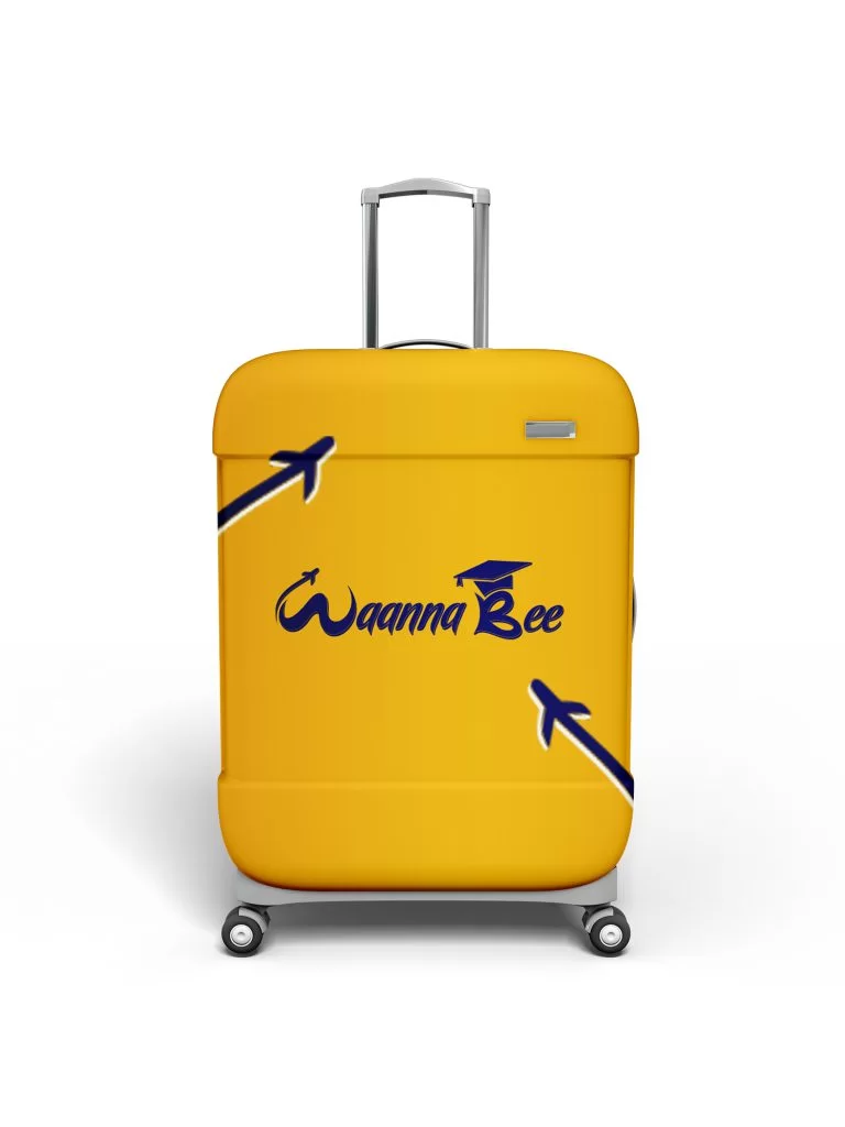
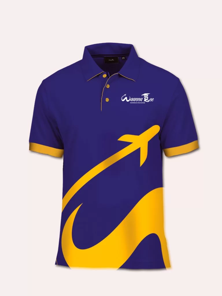
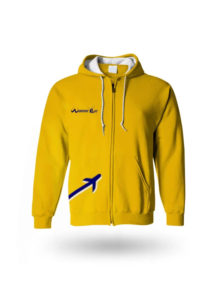
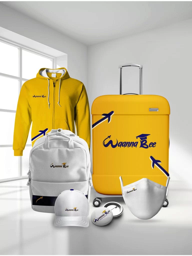
We rebranded their business from the ground up. We suggested structural related name concepts that are highly unique among their competitors. We took a very close look at their new logo, which was a continuation of the existing one but not exact. We focus on the octagon as a figure to create the infinite logo, a unique typography and the symbol make the logo breathe the same harmony. The shape of the new logo enhances the dynamics and becomes the main identifier, combining the elements of visual identity in a single system.
Wanna Be
The logo redesign evolved thoughtfully from the existing identity, preserving familiarity while introducing a stronger visual system. Centered around an octagonal form symbolizing infinity and continuity, the mark was paired with custom typography to create harmony and movement. This geometric structure became the brand’s primary visual identifier, unifying all elements of the visual identity into a cohesive, dynamic, and versatile branding system.