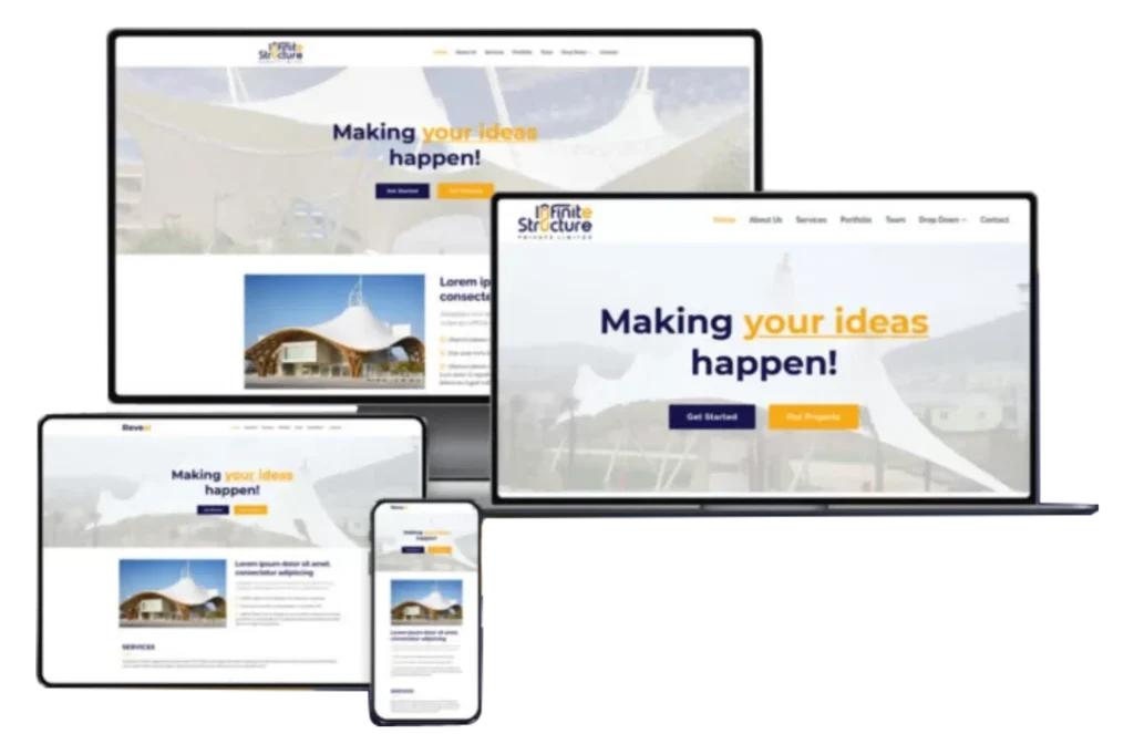
BAM Media Max rebranded their business from the ground up. We suggested structural-related name concepts that are highly unique among their competitors. We took a very close look at their new logo, which was a continuation of the existing one but not exact. We focused on the octagon as a figure to create the infinite logo, where unique typography and the symbol bring harmony. The shape of the new logo enhances the dynamics and becomes the main identifier, combining the elements of visual identity into a single cohesive system. Additionally, we designed brochures that align with the new brand identity, effectively communicating their vision and offerings to their target audience.
Private Limited
Infinite Structure Pvt Ltd, formerly known as Akshayaa Pre Engineerings, is an expert in providing pre-engineered building structures that have been ideal for many warehouses, offices, sites, factories, and more. The team specializes in industrial and warehouse construction, auditorium construction, and other structural work. They are known for their innovative designs and high-quality construction standards. With a commitment to excellence, Infinite Structure Pvt Ltd has established a strong reputation in the construction industry for delivering durable and efficient building solutions.
Logo Concept
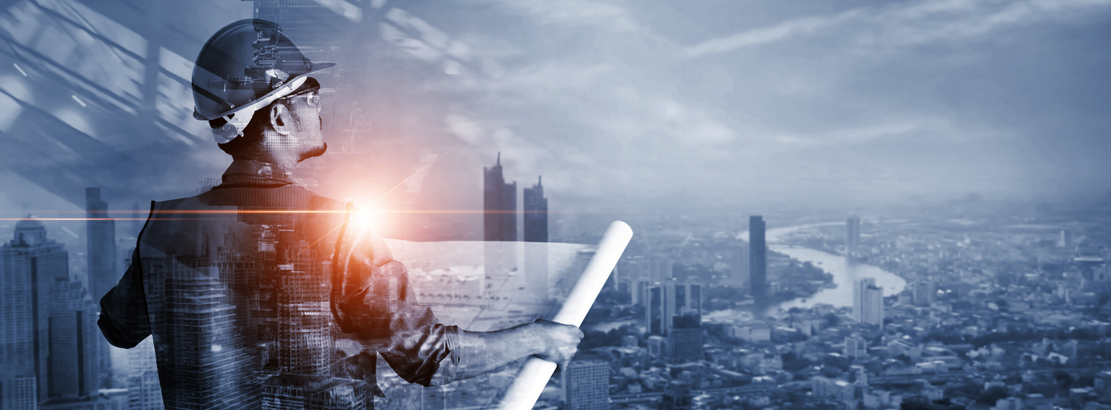
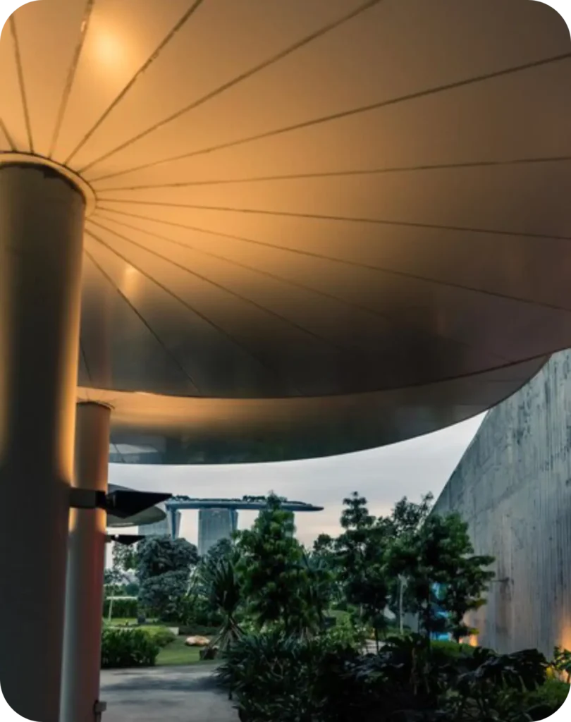
Infinite structures creates a modelling for various building structures. The Structural load calculations Foundation design Roof structure design Structural element design such as plates, arches, shells and more. The logo was conceptualized as typography of infinite structure. The visual identity was inspired by the shape of the roof infinity. The brand mark is formed by the creative combination of letter ‘n’ and ‘u’ it gives the structure of infinity. The upper ‘arrow’ of the n denotes the roofing structure because the infinite structure was expertise of creating the modern tensile structures.
Primary color
The logo has been designed using Blue and Green colours. When the logo has to be used in the print media, the recommended CMYK values can be referred. Alternatively, if the logo needs to be used in the electronic media and will be viewed on screen
Secondary Color
The secondary color was yellow it compliments the primary color depict the feel of the business through the logo.
Brand Typography
Typography plays a vital role in the brand identity. Each font has its own feel. Fonts depends upon the business. We used the Typo Round & Arial
RE-BRANDING
We rebranded their business from the ground up. We suggested structural related name concepts that are highly unique among their competitors. We took a very close look at their new logo, which was a continuation of the existing one but not exact. We focus on the octagon as a figure to create the infinite logo, a unique typography and the symbol make the logo breathe the same harmony. The shape of the new logo enhances the dynamics and becomes the main identifier, combining the elements of visual identity in a single system.
RE-BRANDING
We rebranded the business from the ground up, beginning with the development of structurally driven name concepts that were distinctive and clearly differentiated from competitors. Our approach focused on creating a name and identity system that reflected strength, stability, and long-term vision.
The logo redesign evolved from the existing identity while introducing a refined and modern direction. Centered around an octagonal form, the symbol represents continuity and infinite balance. The custom typography and geometric structure work in harmony, allowing the logo to breathe with clarity and confidence. The resulting form became the brand’s primary visual identifier, unifying all elements of the visual identity into a cohesive and scalable system.